

 LinkedIn
The polished dial on page one says Overall AI Visibility: 64%. It cannot tell you whether a buyer would choose you. I reconstructed a typical AI visibility report to show why: its prompt list, mention rate, share of voice, sentiment gauge, and blended score repeat the vanity-metric habits I watched spread through PPC reporting.
I spent years in Google Ads accounts where an agency could point to an aggregate Quality Score rising from 6.2 to 7.1 while profitable pipeline or CPA barely moved. Google defines Quality Score as a diagnostic tool, not a key performance indicator. A useful diagnostic became a win on a slide. AI visibility reports can do the same thing with a prettier dial.
The artefact: a monthly AI visibility report
This is a representative report, not a vendor’s actual PDF. Its familiar parts are a headline composite score, 50 to 200 tracked prompts, a test log, a mention rate, an engine breakdown with share of voice, and a positive-sentiment gauge. I’ll follow the path a reader takes: start with the number on page one, then inspect the inputs beneath it.
A report like this can still contain useful observations. The question is whether those observations survive a change of prompts, repeated runs, and a check against what buyers actually need. That is the control-group instinct I would bring to any PPC report. If the headline improves while the commercial question stays unanswered, the headline does not get credit.
Line 1: The blended score hides the decisions behind it
The first thing you see is the bold 64% aggregate visibility score. It looks like a measurement of your place in generative search. In practice, it blends choices that need to stay visible: which prompts were tested, how often they were run, what counted as a hit, and which engines supplied the answers. Change those choices and the percentage can move without your business becoming any easier to find or recommend.
This is Quality Score déjà vu, with an extra layer of uncertainty. Quality Score was meant to help diagnose auction performance, yet account managers could spend billable hours nudging an 8/10 toward a 9/10 while CPA climbed. An AI visibility score invites the same mistake: optimize the number because it is prominent, rather than ask what it represents.
The platforms do not all use the same calculation. A score based on brand mentions across all tested queries is not interchangeable with one that considers only responses naming a category player or weights where a recommendation appears. The authoritative-looking percentage conceals those differences. Verdict: keep the underlying observations; do not manage to the composite. You cannot tell which action to take from 64% alone.

Line 2: The prompt list can flatter the brand
Turn the page and you find 50 to 200 tracked prompts. The first inspection is simple: who chose the questions? A vendor may seed them from your homepage or organic keywords. Prompt-tracking platforms calculate visibility across the lists they test, so the list defines the result before any model answers.
Traditional search terms are often short fragments: ‘fleet tracking software’ or ‘b2b billing platform.’ A buyer’s question can be messier: ‘We run QuickBooks Online for three entities with multi-currency billing; what inventory management software connects via API without enterprise onboarding fees?’ A model answering the broad category term may produce a long list of logos. Your brand appears at number eight, the tracker marks a hit, and the score rises. That is not the same as being selected for the buyer’s constraints.
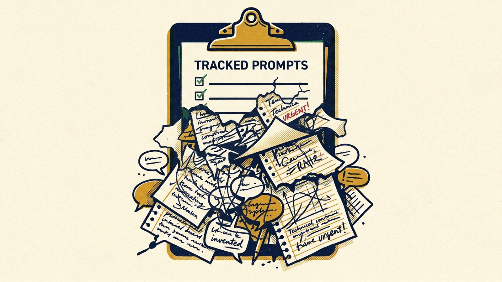
Put buyer friction ahead of suggested prompts
Suggested prompts are a starting point, not a commercial test. If you want to know which questions matter, build the list from three places you already use to understand purchase decisions:
- Closed-lost reasons in your CRM.
- Comparison wording and objections recorded in sales calls.
- High-intent converting terms in your Google Ads search term reports.
Those sources yield questions such as ‘alternatives to [Competitor],’ ‘[Brand] vs [Competitor] implementation time,’ and ‘software that integrates with [Legacy Tool].’ They test whether the model can match your product to a stated requirement, not merely recall your name when asked for a category.
I used to see the PPC version of this in broad, unqualified keywords that produced impressive impression volume. The number was real; its importance was not. A broad AI prompt has the same appeal because an established category player is easy for a model to name. A constrained prompt asks whether that player survives the buyer’s shortlist. Verdict: use the vendor’s list only after you have tested it against actual buyer friction.
Line 3: One run per prompt is an anecdote
Next comes the test log. It may show a prompt, an engine, a date, and a tidy yes-or-no result for whether your brand appeared. The problem is the denominator. If the tool runs a prompt once a week on an engine, one answer becomes the apparent state of your visibility for that week.
Generative answers vary. Practitioners tracking AI search describe different outcomes from repeated runs of the same prompt: a brand can be recommended, mentioned in passing, or omitted. A single positive pull tells you what happened in that pull. It does not establish a stable position. I would not trust a PPC conclusion drawn from one impression per keyword, and I would not trust this one either.
The testing environment matters, too. A backend API query without conversational history or the context of a buyer’s session is not necessarily the answer that buyer sees. The report should make its method plain rather than present a clean test as a census of real conversations.
Before you use the score to guide spend, run a repeatable AI mention audit. Test each high-intent prompt at least ten times per engine in clean sessions, record how the answers vary, and separate recommendations from mere appearances. Ten runs will not make the output permanent. They will show you whether the report’s single hit was sturdy enough to take seriously. Verdict: a one-run check is a sighting, not a trend.
Line 4: The mention rate counts unlike outcomes together
After the log, the report totals its hits. This is where ‘visibility’ starts doing too much work. Monitoring dashboards can group mentions, citations, and recommendations together, even though each tells a different commercial story:
- A mention means your name appears in the response. The model might list your brand among legacy players and then describe a drawback. A text match can still count it.
- A citation means the response links to your domain as a source. A buyer may click through, but the link does not mean the model chose your product.
- A recommendation means the model selects your product for the user’s stated need and explains the fit.
Suppose a report says 70% visibility. If most hits are passing mentions in long lists and none answer the buyer’s constraints with a direct recommendation, that headline is a poor guide to pipeline. A citation deserves its own line because it may bring a buyer to the site. Neither event should be quietly promoted to a recommendation.
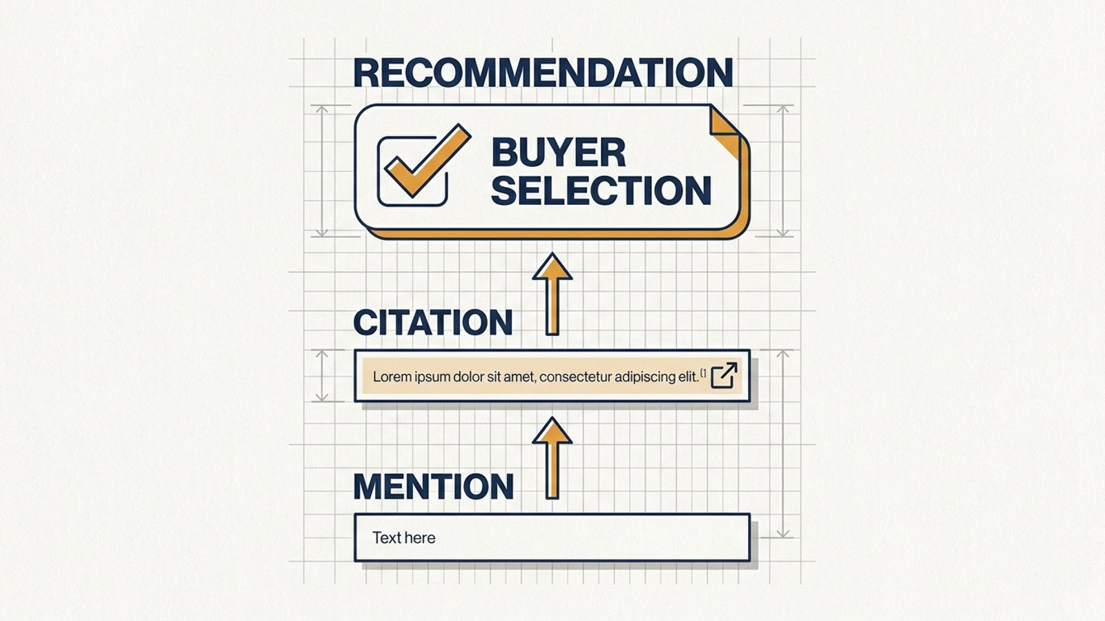
Verdict: split the count. If the tool cannot show which hits were mentions, citations, and recommendations, its mention rate cannot tell you whether the work is moving closer to a sale.
Line 5: The engine bars and share of voice blur the field
The next page offers neat bars for ChatGPT, Gemini, and Google AI Overviews. They make cross-engine performance easy to scan, which is useful. The trouble starts when the report averages those bars as though the engines return answers in the same way. They do not operate as one channel, and a combined gain cannot tell you where your team should work next. It is like averaging Google Search CTR with a Meta video view-through rate: you get a number, not a decision.
Beside the bars, look for share of voice and its competitor pool. AI share-of-voice reporting can use a closed set of tracked competitors. If you entered a handful of brands during onboarding, a 45% share may describe only that group. The model is free to name other businesses in its answers. The report needs to show both the set it tracked and the brands that actually appeared; otherwise, the share sounds broader than its denominator.
There is useful work hiding here. If a high-friction prompt consistently produces a rival’s recommendation on one engine and not another, you have a specific gap to inspect. An average across engines smooths that gap away. Verdict: keep engine-level results and the full observed competitor set; discard the cross-engine victory lap.
Line 6: Positive sentiment can coexist with wrong facts
The last reassuring widget is the green sentiment dial. It tells you the model used positive language, perhaps at 80% or 95%. It does not tell you whether the answer was right. Language models are trained to produce measured, helpful responses, so a polite description of your business is hardly an exacting commercial test.
Read the answer instead. Did it state the right pricing tier, integration, security certification, or target market? A pleasant paragraph can still give a buyer outdated pricing or describe a feature your product does not have. It can also say you lack a capability you do have. In an evaluation conversation, those errors matter more than whether the prose sounded warm.
That does not make every sentiment observation worthless. It makes the gauge secondary to the claims inside the answer. Verdict: audit factual accuracy before celebrating tone. A green dial will not correct a bad buying decision.
What survives: three numbers worth paying for
Once the report’s inputs are visible, I would keep three measures, reported separately. None needs a blended score to look important.
- Recommendation rate on high-friction buyer prompts. Build the prompt set from closed-lost reasons, sales objections, and converting search terms. Run each prompt repeatedly by engine and count the answers that select your product for the stated constraints. That tests commercial fit rather than name recognition.
- Verified citations to converting URLs. Count direct, clickable links to relevant product, case study, or pricing pages in the answers you tested. Record the destination. A citation is not a recommendation or proof that every claim is correct, but it is a distinct opportunity for the buyer to reach your site.
- Factual accuracy on purchase-critical details. Check the answer’s statements about pricing tiers, integrations, security certifications, and target market, manually or through a systematic audit. Record what is wrong, not just whether the paragraph is positive.
Those numbers still need the prompt list, engine, sample size, and testing conditions beside them. Otherwise, you have built another attractive dial. If a tool cannot show these measures independently, I would not pay for its headline score.
What the report cannot do: repair a lost recommendation
Even a rigorous monitoring report remains a report. Passive AI visibility dashboards track losses; someone else still has to decide what to change and do the work. A Monday PDF showing that a competitor displaced you in a useful answer does not update a page, correct a factual gap, or adjust a paid-search campaign. It gives an already busy team another task.
That is the distinction behind groas’s approach. groas operates as a fully autonomous growth engine across paid and organic search, with specialized AI models executing campaign, content, bidding, targeting, budget, and optimization work continuously. A named human strategist sets direction, guardrails, and accountability; action logs show what the system did. Instead of asking a growth lead to interpret another dashboard and carry its to-do list, the model is built around execution tied to business outcomes.
That does not make a bad prompt bank good or turn every citation into revenue. The same skeptical test still applies: which buyer question changed, what action followed, and did it move a business outcome? The difference is that observation does not have to be the final deliverable.
Overall verdict: keep the evidence, lose the dial
Before renewing a dashboard or sitting through another demo, I would ask three questions in order:
- Who selects the prompts, and when do they change? A static bank of category keywords may measure recall while missing the objections that decide a purchase.
- How many runs sit behind each result? One weekly answer per prompt and engine is too thin to call a stable recommendation rate.
- Who acts when a recommendation is lost? If the tool only marks the loss in red, your team still owns the repair.
If you are weighing a contract, read our open letter to the owner about to buy an AI visibility dashboard. My verdict on this report is not to throw away every line. I would keep the buyer-derived prompts, repeated engine-level answers, verified citations, and factual corrections. I would leave the 64% dial behind. It is the easiest part to show a board and the least useful part when a buyer is about to choose.